Are you stuck at home but you still want to make art and nature journal? Me too! That’s why I made this video on how to make a landscape painting from photos. Whether you are stuck at home because of the weather, because of a pandemic, or because it is dark outside this guide will help you. Learning how to use reference photos for watercolor painting is a good skill to build regardless.
The 11 Step Guide To Landscape Painting From Photos:
- First, you make a pot of tea. Actually, this is a very important step.
- Next, you create the station where you are going to be working. Since you are going to paint from photos of landscapes on your computer or iPad make sure you get the area organized. Get all your materials ready: watercolor, towel, brushes, pencils, nature journal,
- Third, choose your photo wisely. No matter your skills, your final drawing or painting is only as good as the photo it is based on. Certain things like sunsets are also extra hard to paint accurately so let us avoid those. Unfortunately, many beginners are attracted to sunsets. Hence the many amateur painting of sunsets online. We will get to sunsets once we build some basic skills.
- Fourth, crop and edit your photo for better painting. In the video I go into depth about how important cropping is. By cropping your photo intentionally you can make your painting more dramatic and you can incorporate important design elements such as the “rule of thirds.” Additionally, you can focus on the values better by turning your photos of landscapes into black and white.
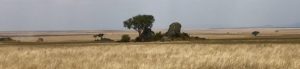
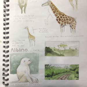
- Next, we jump into the landscape painting process by drawing the basic shapes. Being able to simplify a landscape into 3-8 major shapes is essential. It is the arrangement of these basic shapes that gives the landscape painting it’s feeling and impact.
- After drawing the shapes it is time to lay in the lights and darks. You should aim for 3-8 gradations from light to dark. The sky is always the lightest. These gradations should match the simplified shapes from step 5.
- Now, it is time to go back and add another level of darkness to your landscape drawing. Pay attention to the dark spots in your photo reference and try to match these in your drawing.
Watercolor Painting Time!
- Now, it is time to really start painting from your photo. Turn the photo back into color then take out your watercolor and start laying in washes. First, do the paler washes such as the sky and the background. Focus on keeping the values correct.
- Add local color accents. Now, look at your photo reference and try to match some of the specific colors. But remember, these are accents so they do not need to go everywhere. And the most important thing is that your 3-8 major blocks are still recognizable separate.
- Now, add more contrast in the foreground elements and push your values a little more. Most of the time watercolor landscape paintings end up to pale.
- Finally, take a look at the reference photo for your watercolor painting and compare it to your actual page. Where could you do better? Try turning the photo back to black and white. How close are your values? For bonus points do another version of this landscape but with charcoal or graphite.
Painting from photos gives you a lot of tools to improve your landscape painting skills!
For more landscape painting ideas, especially for mini-landscapes check out this post
Don’t forget to watch the video for all the pro tips!

2 Responses
Thanks, Marley. This was helpful. I just knew there was something wrong with a shorescape I recently attempted at Muir Beach. Too much detail in the water! Dark trees backing dark rocks! Next time I’m starting with a value sketch. I don’t think the result will be as disappointing.
Hi Renee, it sound like you have diagnosed two issues in your painting and come up with a strategy for next time. That is awesome! Keep it up.